Have you ever entered a kitchen and been immediately inspired by the way the colors seemed to talk to your sense of design? That’s the power of the right kitchen colors schemes. If you’re changing up your space, starting with a new paint job or adding new touches to your cabinets, this guide highlights the most exciting kitchen color schemes and paint picks right now. Wondering how to mix trend-forward colors with timeless charm? You’re about to find out.
Timeless Kitchen Color Schemes That Never Go Out Of Style
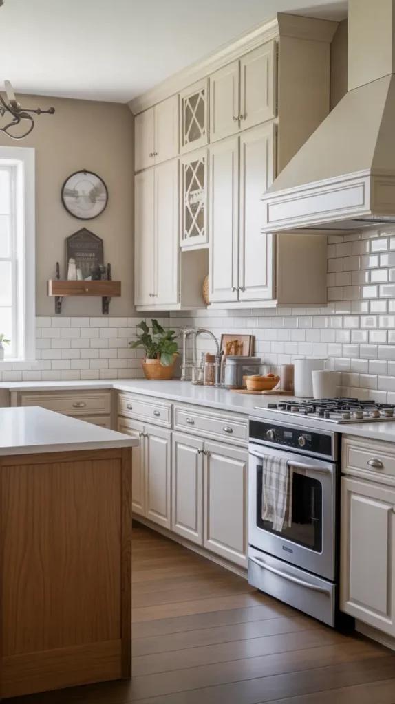
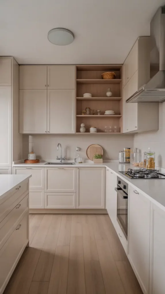
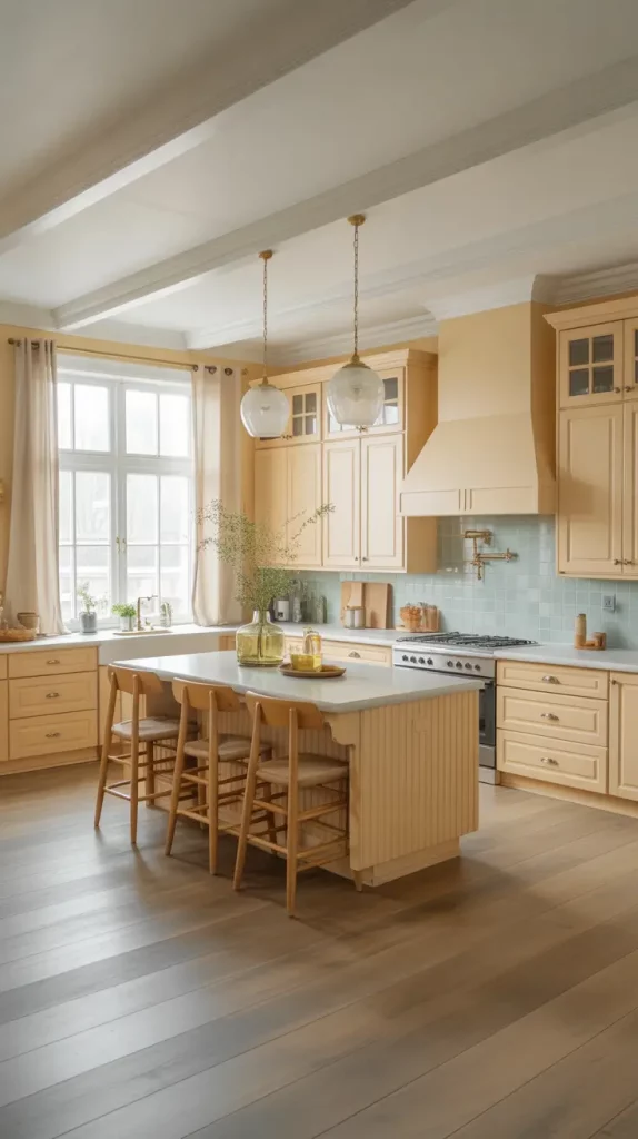
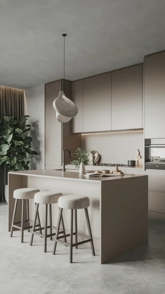
Based on what I’ve seen, some kitchen colors never go out of style because they make the room feel comfortable and refined. White, grey and taupe colors together give a room a style that can be adjusted to different decor trends. If you want your kitchen to look stylish anytime, these tones are just right for you. In homes built some time ago, they match features such as crown moldings and vintage wood floors.
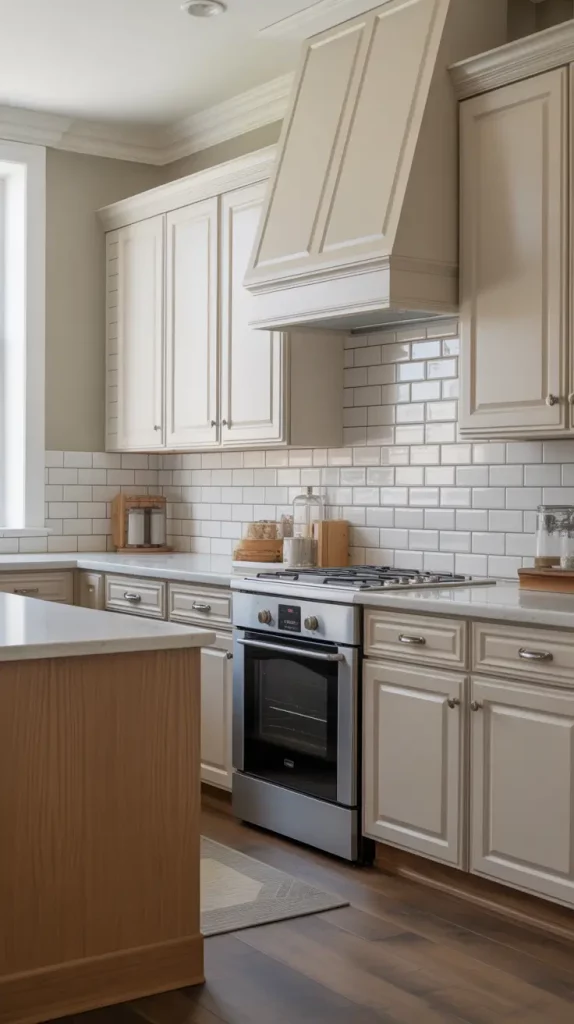
I enjoy putting together a soft greige wall, white cabinetry and brushed nickel hardware. A subway tile backsplash in a traditional style fits well with a classic palette and leaves room for some fun touches in your decor. I usually include a warm oak or walnut wood island to give the colors stability and add natural touches. This layout never feels sterile or dated.
I once read in Elle Decor that designer Shea McGee appreciates how neutral colors can be enhanced by zellige tiles and quartzite countertops. I understood what she meant—I’ve noticed that using neutrals allows people to update their home decor more easily with the seasons and in the future.
What would take this scheme to the next level? You can give the kitchen a modern touch by installing soft brass lights and matte black faucets, without losing its classic charm.
Modern Kitchen Color Schemes That Feel Fresh For 2025
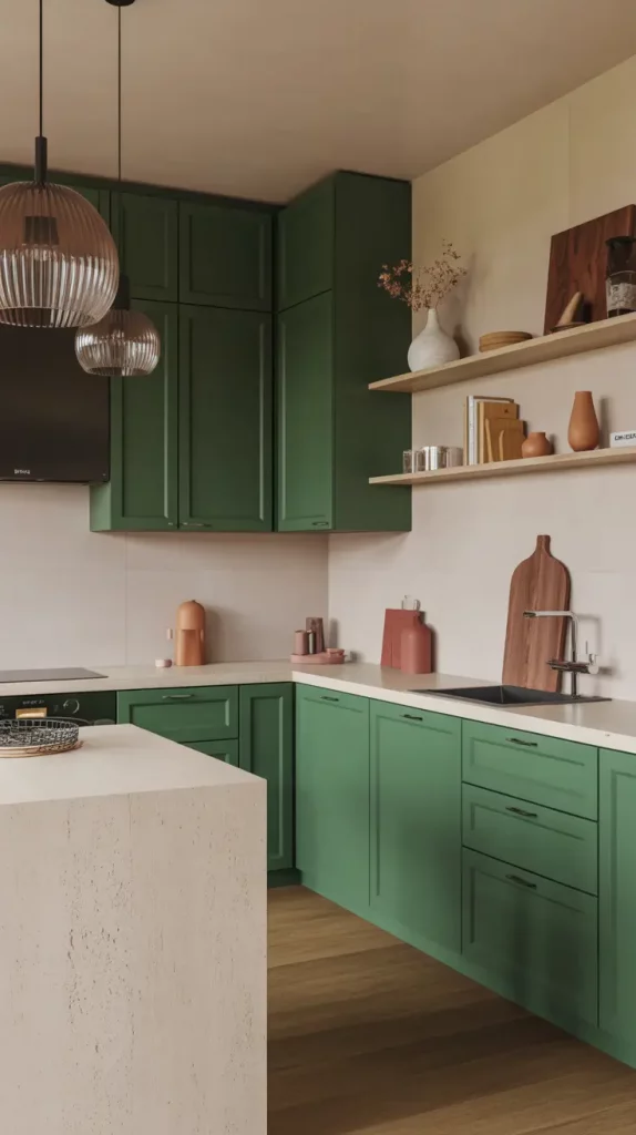
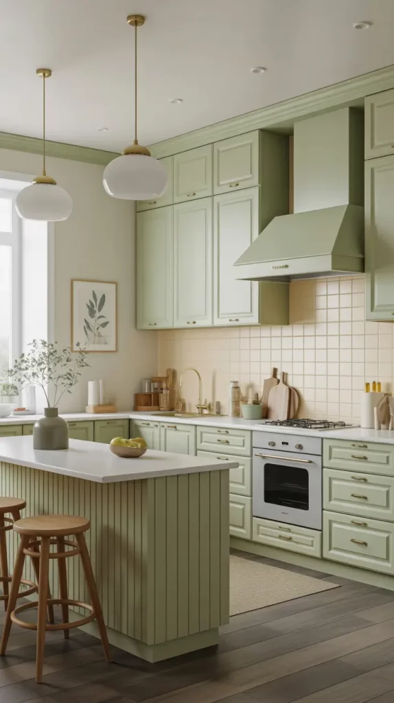
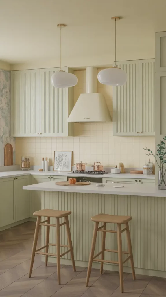
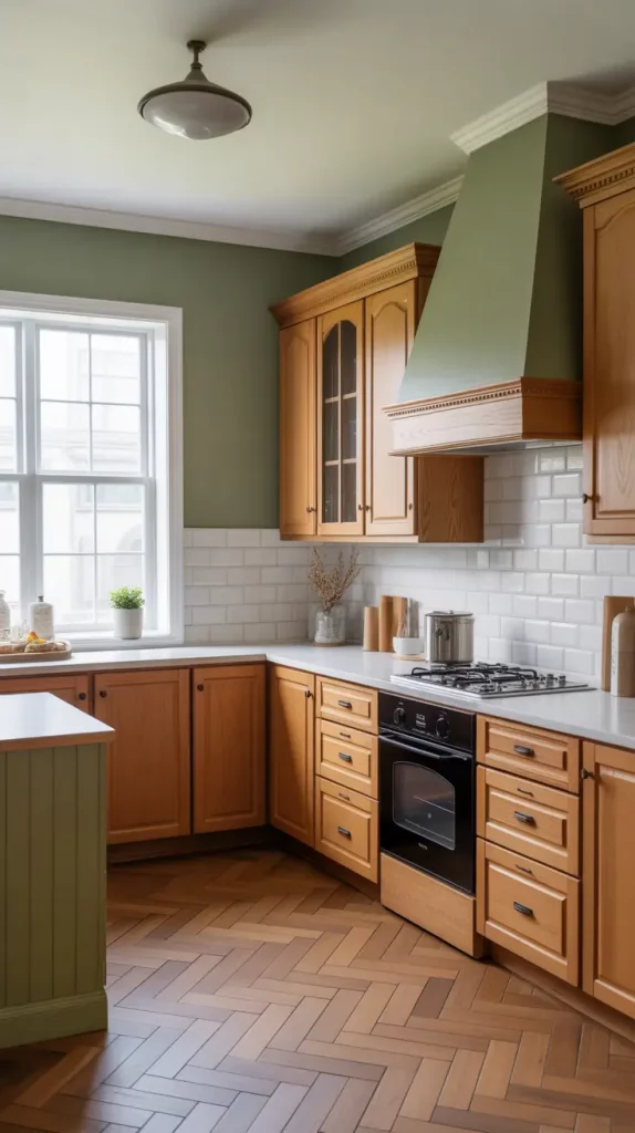
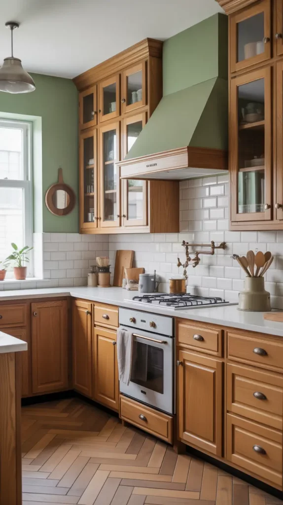
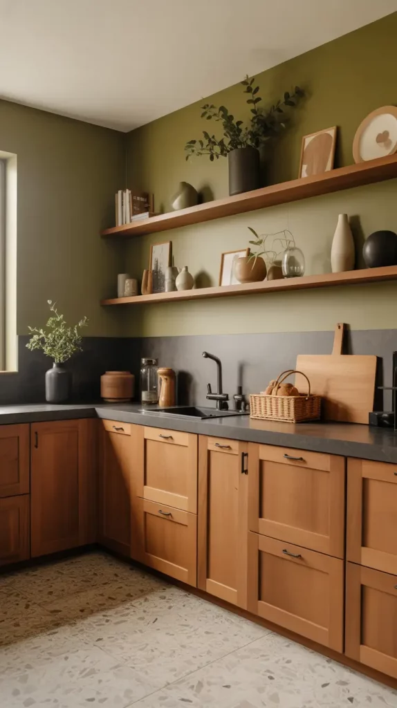
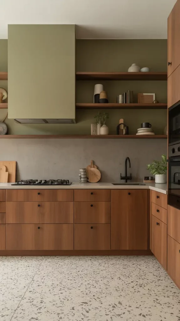
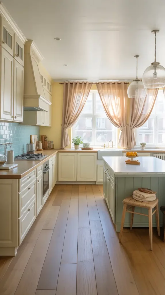
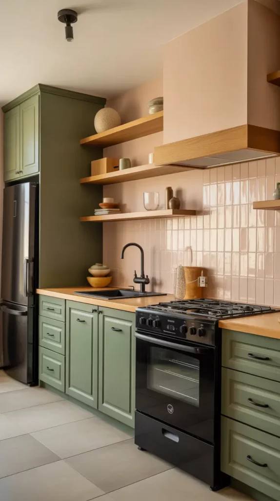
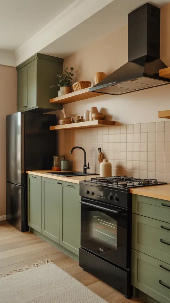
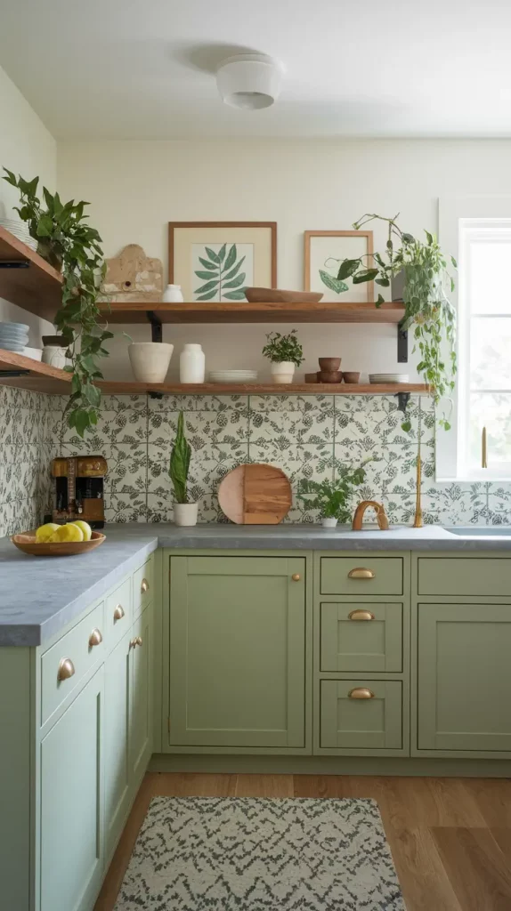
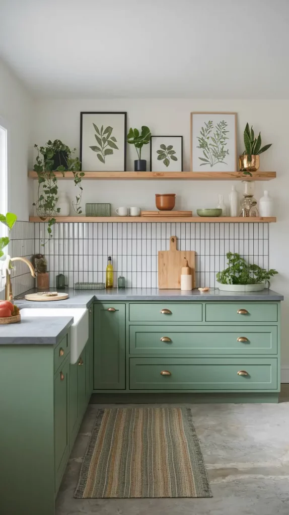
Kitchen color trends in 2025 are moving towards a warm-modern minimal style. Choose olive greens, plums and natural stones and balance them with white or beige. They give a sense of comfort and style and I like them most in places where the kitchen opens to the living area.
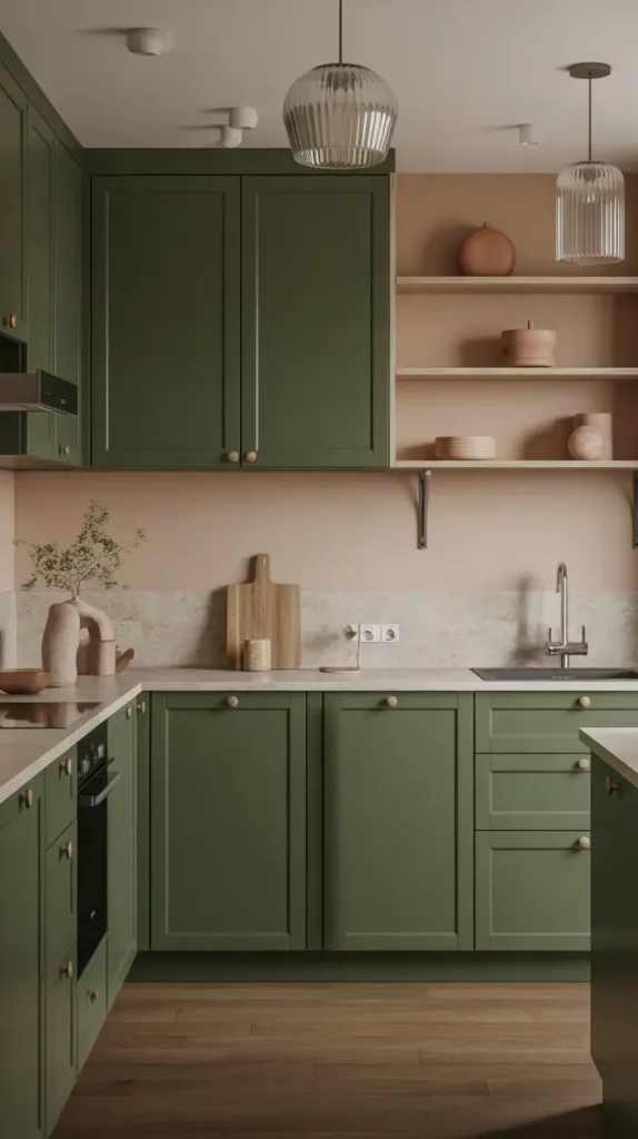
At the moment, I really love the look of creamy walls, dark green lower cabinets and light wood open shelves. I also find that honed travertine or soapstone countertops look great with this color scheme. The result is a warm and stylish atmosphere. Fill your space with clay or terracotta pottery, woven stools and fluted glass pendant lights to make it cozier and more interesting.
According to Leanne Ford in a recent Architectural Digest article, matte surfaces and muted natural colors give a kitchen a “quiet luxury” feel. I couldn’t agree more. When I chose this color scheme for a client’s kitchen last year, it looked both elegant and personal.
If you’re updating your space, I’d recommend using contrast: matte green or clay for the bottom, creamy quartz for the top and light oak floors to keep things open.
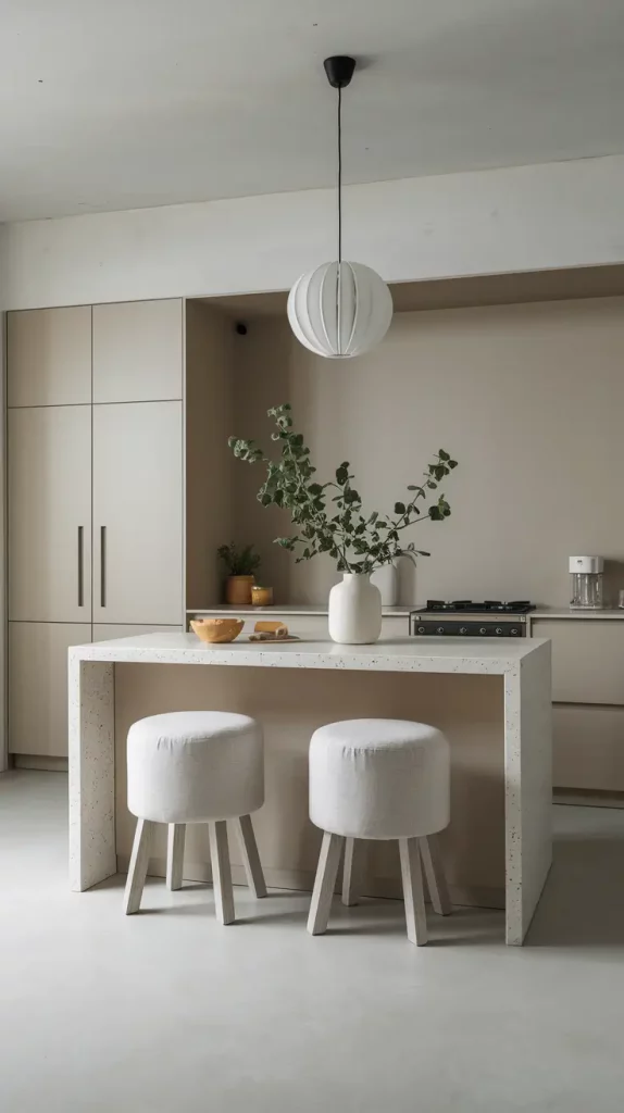
Classic Neutrals That Make Any Kitchen Feel Bigger
When you want to make a small kitchen look more open, use neutral colors. I often choose soft almond, pale sand or nearly-grey walls, along with white cabinets and either glass or open shelves. It adds brightness and also helps the room look less cluttered.
I usually suggest choosing a pale grey quartz countertop, slimline chrome fixtures and a white backsplash. Stools made from acrylic or linen give the room a light feel and open shelves instead of bulky cabinets help save space. A big mirror or a backsplash made from glass can brighten the kitchen.
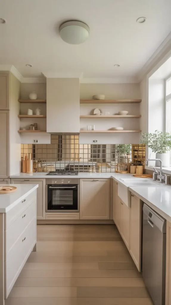
I really like what Nate Berkus said: “The most interesting rooms tell you a little about the people who live there.” By choosing neutrals, you can tell your story by adding texture, old pieces or art without making the room look cluttered.
If I could make a change, I’d add a neutral geometric rug to tie the floor together and add a gentle pattern to the space.
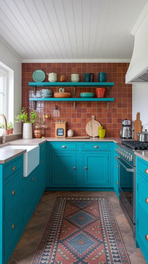
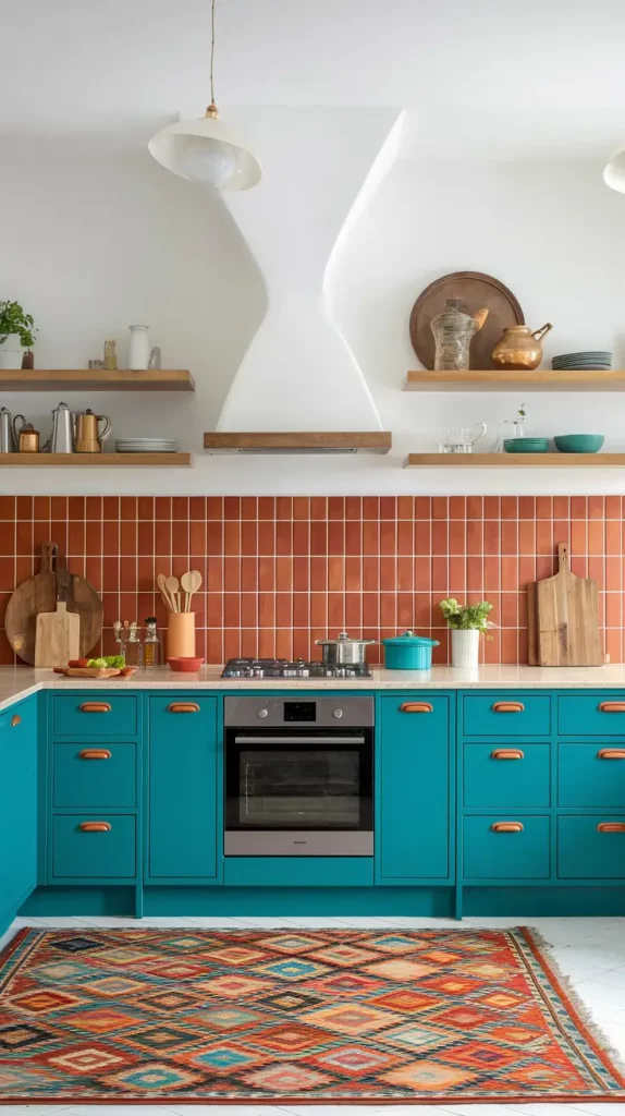
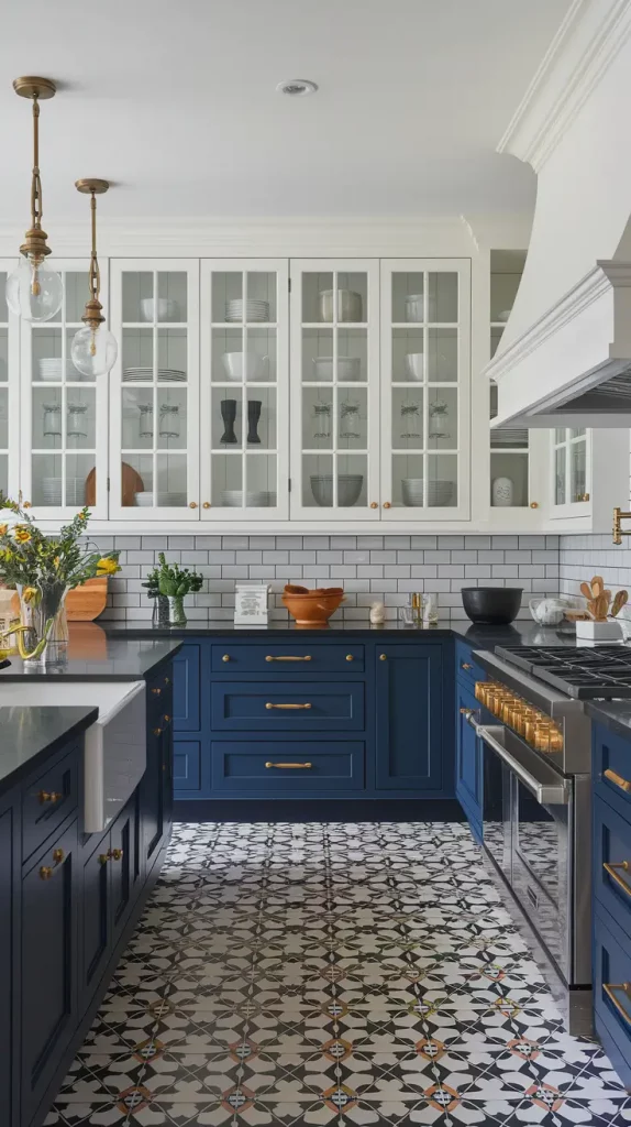
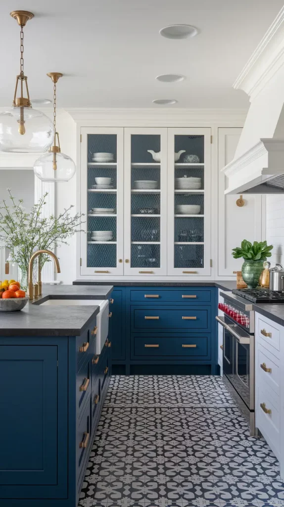
Bold Kitchen Color Schemes To Make A Statement
If a client wants their kitchen to have personality, I suggest bright colors like cobalt blue on the walls, black cabinets with gold accents or a burgundy island. Bold shouldn’t be confused with chaotic—it’s about purposeful use of color and contrast. They are most effective when the kitchen is the main gathering area in the house.
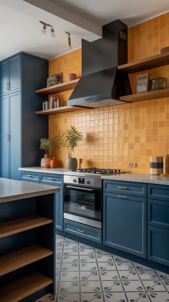
Imagine having navy or charcoal cabinets and a bright marigold tile backsplash. Add some walnut shelves, put in vintage brass sconces and finish the look with a terrazzo countertop. I often add some visual breathing room by using pale floors or a white ceiling to help keep the space balanced.
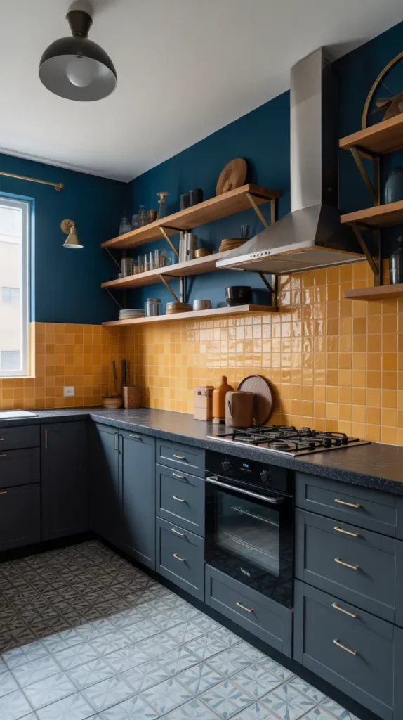
According to Orlando Soria on HGTV, statement kitchens are not meant to surprise, but to be well-planned. That’s the ethos I follow when designing these spaces. If designed properly, a bold kitchen will be the one guests remember the most.
I might add floor tiles with a striking geometric design to bring the same drama from the counter to the rest of the room.
Soft And Subtle Hues For A Calm Cooking Space
A soft color scheme for your kitchen can help it feel more peaceful which is great if your kitchen is often used by a busy family. I prefer colors such as misty lavender, powder blue, soft clay and light sage. These colors are ideal for blending serenity with style.
I really enjoy the look of light sage green cabinets, off-white stone countertops and a creamy glazed backsplash. Choose brass handles, glass pendants and white oak stools to give your cottage a modern look. The entire design is refreshing.
Apartment Therapy highlighted a calm Boston kitchen that used almost the same combination of colors. The designer said that cooler pastels are becoming popular again, both for their appearance and for the peaceful feeling they add to our daily routines.
If I were making changes to this palette, I’d consider adding some wall art or framed botanical prints in light colors to add more interest without disturbing the peaceful atmosphere.
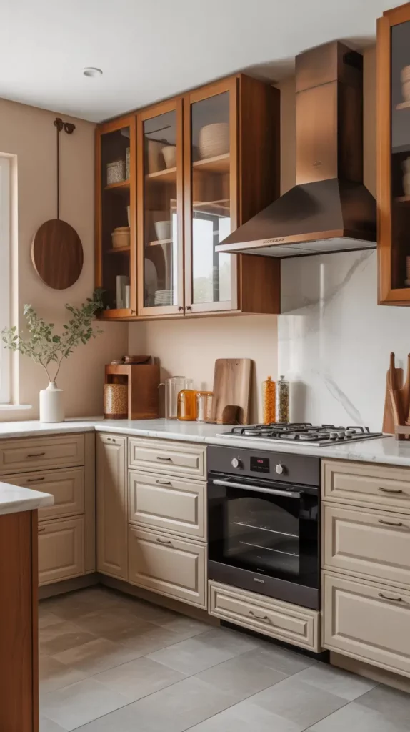
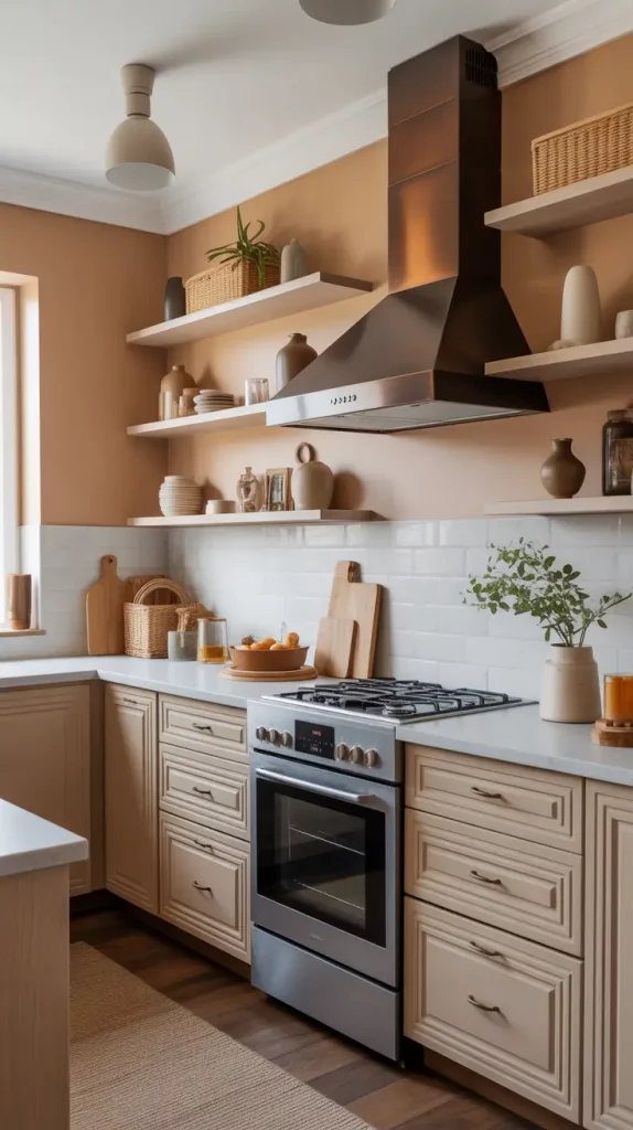
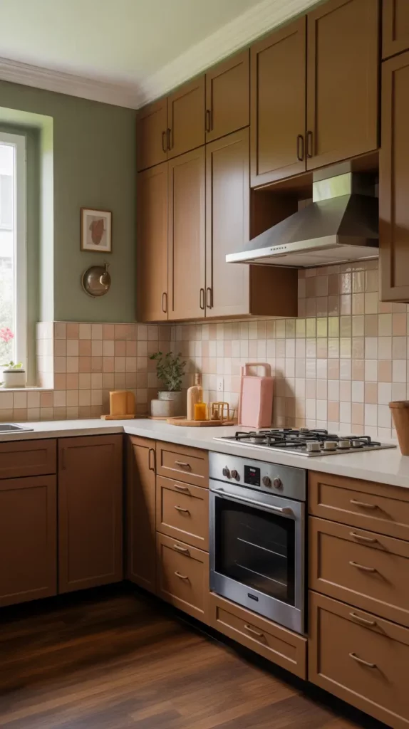
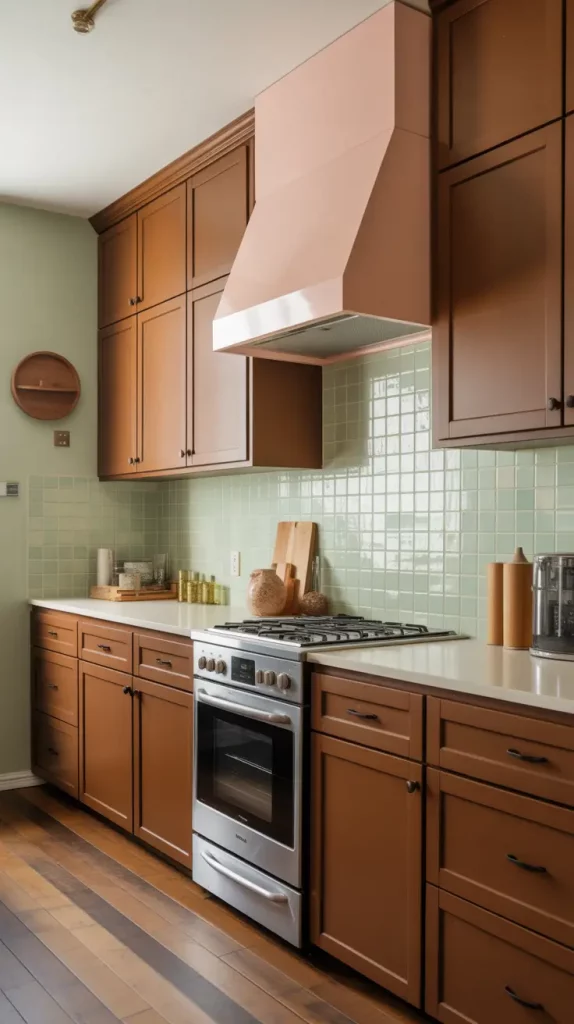
Cozy Earth-Toned Kitchen Color Schemes
There’s nothing better than the comforting feel of kitchen colors that are earthy such as ochre, terracotta, sienna and muted olive. I like to use them in places where we combine rustic and refined styles. You can create a lovely look by using these shades with rattan, clay and raw wood.
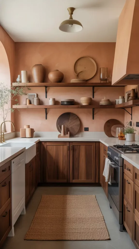
A personal favorite? Walls made from terracotta, walnut wood cabinets and countertops in creamy quartzite. Finish the room by placing a jute rug, antique brass faucets and rustic ceramic vases in it. You could also put up vertical tongue-and-groove panels painted in a light clay color to make the space more charming.
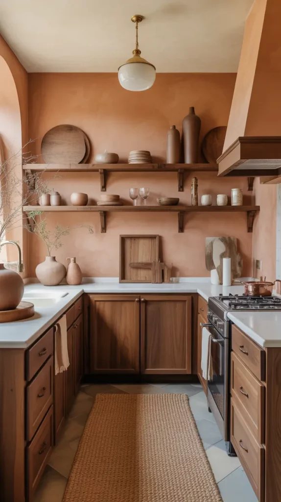
Justina Blakeney recently told Domino Magazine that earth tones “make us feel connected to something deep inside.” They’ve worked wonderfully for me—if you want a home that feels cozy and put together, they’re great.
I suggest including a built-in bench with olive-green cushions and terracotta accent pillows so you have a cozy breakfast nook.
Trending Kitchen Color Schemes For 2025 You’ll Love
It is clear from the kitchen colors schemes in 2025 that peachy colors, warm browns, marine blues and rich charcoal are the leading trends. They blend nicely between warmth and coolness and I use them a lot in kitchens with open spaces that need a unified color scheme.
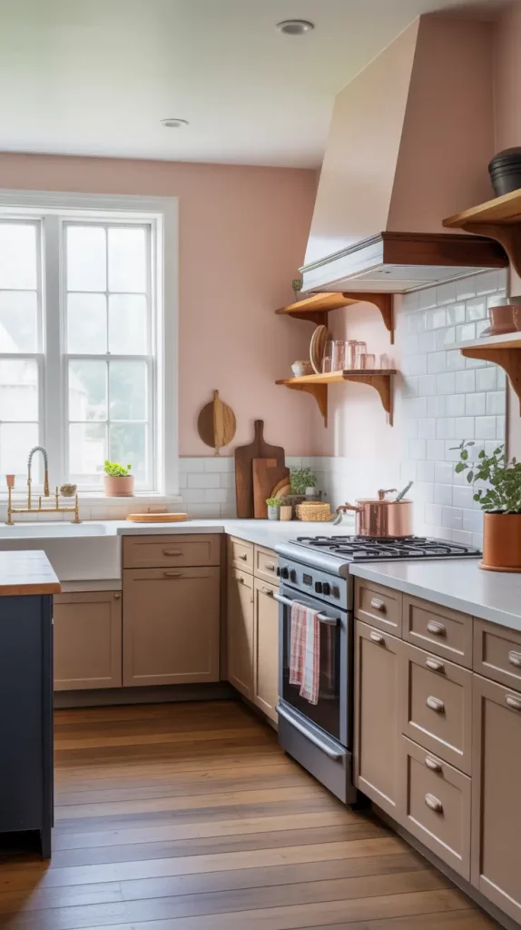
A great way to follow the trend is to use brown cabinets, creamy pink walls and deep navy islands. Add some brushed copper details, put in marble-style counters and install open walnut shelves. I find it fascinating that the light changes in this trio as the sun goes through the sky.
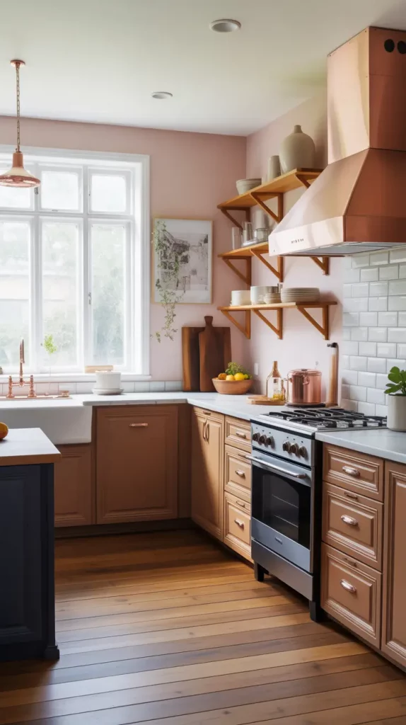
Browns and marine tones are expected to make a comeback, according to Better Homes & Gardens, who say they are drawn to their emotional depth and connection to nature. Many of my clients have grown to love the surprising and sophisticated combinations that give their kitchens a warm and unique feel.
For a larger project, I’d add textured wall materials such as limewash or plaster to give the new neutrals a tactile effect.
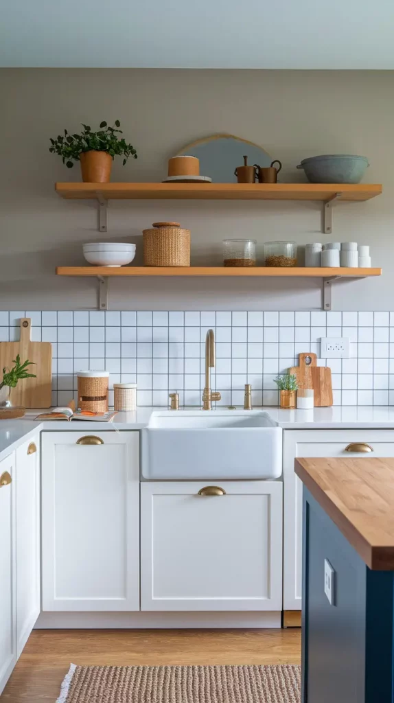
Elegant White Kitchen Color Schemes With A Twist
When clients ask for a clean, bright space but want something more than basic, I often recommend kitchen colors schemes white cabinets with a twist. The base remains classic—crisp white shaker or slab cabinets—but we layer in soft color touches through backsplashes, wall paint, or island cabinetry. This approach keeps the kitchen timeless but adds a custom, design-forward edge.
I usually start with matte white cabinets and layer in accents like a pale blush or dusty mauve backsplash. For the island, a muted sage green or powder blue can bring just enough contrast. Add touches like glass-front uppers, fluted wood stools, or curved brushed gold fixtures. These details give warmth and style to what could otherwise feel clinical.
I remember reading in House Beautiful that “the new white kitchen isn’t white alone—it’s layered, nuanced, and personal.” That insight stayed with me. One of my recent projects had a soft lilac-painted ceiling, and it made the whole space feel unexpectedly luxe while preserving the lightness of white cabinetry.
If I could enhance this scheme further, I’d introduce a pattern—maybe a light Moroccan tile on the floor or an arched, tiled hood vent—to create visual interest without overpowering the space.
Best Paint Colors For Kitchen Color Schemes This Year
Choosing the right kitchen colors schemes paint is like finding the perfect base coat for a home’s personality. For 2025, I’m seeing a surge in colors that feel grounded yet creative—like sand-dune beige, foggy blue, and caramel latte. These shades feel livable and soulful and can suit modern or traditional interiors depending on the materials used.
For painted walls, I like Benjamin Moore’s Pale Oak, Sherwin-Williams’ Urbane Bronze, or Farrow & Ball’s Hague Blue. These shades pair beautifully with a range of materials—natural stone, marble, butcher block, or even concrete. Combine them with white, wood cabinets, or mixed metals to adapt the vibe as needed. Accent colors in warm spice tones can elevate this even further.
Design Milk recently praised caramel and wheat tones as the “perfect bridge between cool minimalism and warm maximalism.” It’s exactly why I often use these for kitchens that need flexibility and personality.
I’d round out this section by recommending matte finishes over gloss. Matte paint feels current and photographs beautifully—a plus if your kitchen doubles as a social media backdrop.
Kitchen Color Schemes That Pair Perfectly With White Cabinets
Kitchen colors schemes white cabinets offer so much versatility—it’s one of the reasons I recommend them so often. But the key is choosing wall and accent colors that enhance their crispness rather than make the kitchen feel flat. You want balance: warmth, contrast, or softness to bring it to life.
One of my favorite pairings is white cabinets with soft gray-blue walls and aged brass pulls. Or you can go a little warmer—think creamy tan walls with caramel leather stools and oak shelving. These combos add layers without disrupting the elegance of the white cabinetry. I also like adding a backsplash in glazed ceramic or handmade tile to bring subtle texture and depth.
Martha Stewart Living once suggested pairing white cabinetry with smoky lavender or dusky green for an unexpected twist. I tried the smoky lavender recently in a project, and the result felt serene, even romantic.
What would elevate this look even more? An oversized pendant light or mixed-material countertops—like marble for the island and butcher block for the perimeter—adds richness and subtle drama.
Chic Kitchen Color Schemes With Oak Cabinets
Designing around kitchen colors schemes with oak cabinets can be surprisingly stylish if you embrace the wood’s natural warmth. Rather than fighting the golden or amber tones, I love leaning into them with complementary colors like muted greens, soft greys, and even inky blues. The result feels earthy and fresh.
For a refined look, I often pair oak cabinets with soft sage or dusty green walls. A creamy white quartz or travertine countertop brightens the setup. I like to incorporate matte black hardware or oil-rubbed bronze fixtures for contrast. Finish with pale tile flooring or warm gray herringbone for balance.
Architectural Digest mentioned that oak is making a full comeback, especially in Scandinavian and Japandi-style kitchens. And I agree—it’s sustainable, approachable, and has great texture.
To take this look up a notch, I’d suggest adding subtle texture—like linen roman shades, vintage rugs, or even a live-edge oak island that harmonizes with the cabinetry without being overly matchy.
Dark And Moody Kitchen Color Schemes That Wow
I’ve always been drawn to kitchen colors schemes dark cabinets—they offer so much drama and sophistication, especially when paired with the right lighting and accents. Deep navy, charcoal, or forest green can make a space feel cocooned, elegant, and very high-end. These shades aren’t just for massive kitchens—they can work in compact spaces too, with smart lighting.
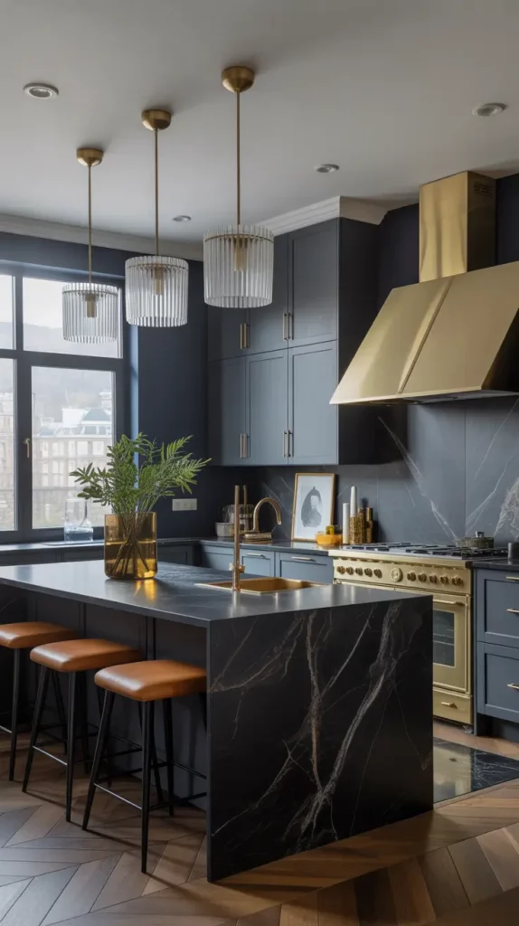
I often design with dark lower cabinets, marble or quartz countertops, and lighter upper shelves to prevent the room from feeling closed in. I love mixing in antique gold fixtures, fluted glass pendants, and leather or wood stools to add a touch of warmth. A waterfall island in black stone makes a striking centerpiece.
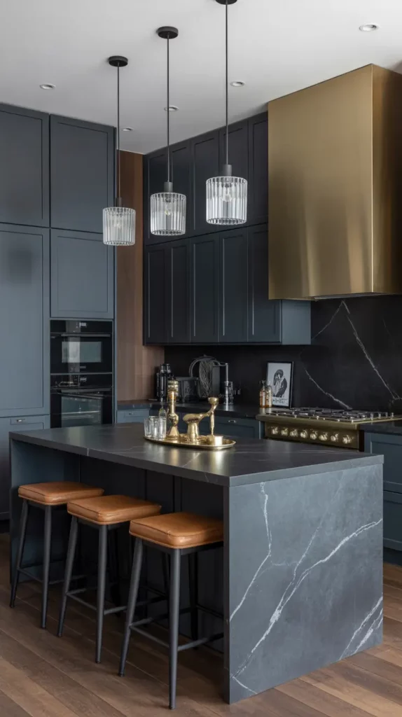
Emily Henderson recently wrote that “dark kitchens are for brave souls—and they almost always win big.” I agree. When done right, they command attention and look ultra-curated.
What’s missing here? Maybe some softening elements—a fabric-covered bench, a vintage rug, or a wall of open shelving to lighten the mood and personalize the space.
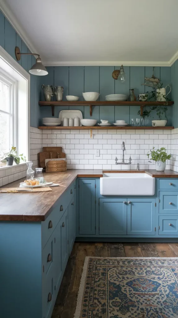
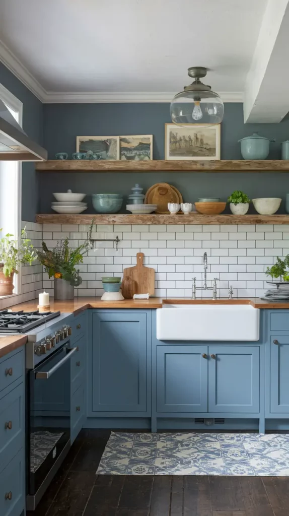
Blue Kitchen Color Schemes That Feel Coastal And Cool
Kitchen colors schemes blue are practically timeless, but what’s trending now are complex, chalky shades—think slate blue, dusty periwinkle, or sea glass. These tones evoke serenity and coastal freshness without leaning kitschy. I use them in both beachy cottages and contemporary homes to create a relaxed, open feel.
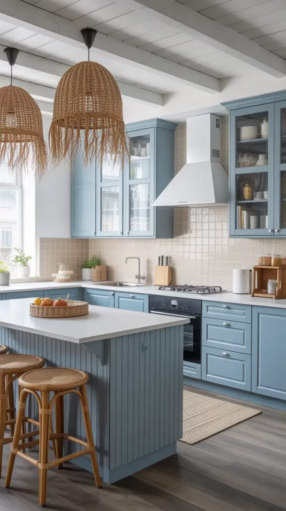
One of my top combos: slate blue lower cabinets, white uppers, and a sand-toned tile backsplash. Add rattan stools, white-washed wood beams, and seagrass pendant lights to complete the coastal look. I also love pairing blue cabinetry with light gray quartz countertops for a subtle tonal shift.
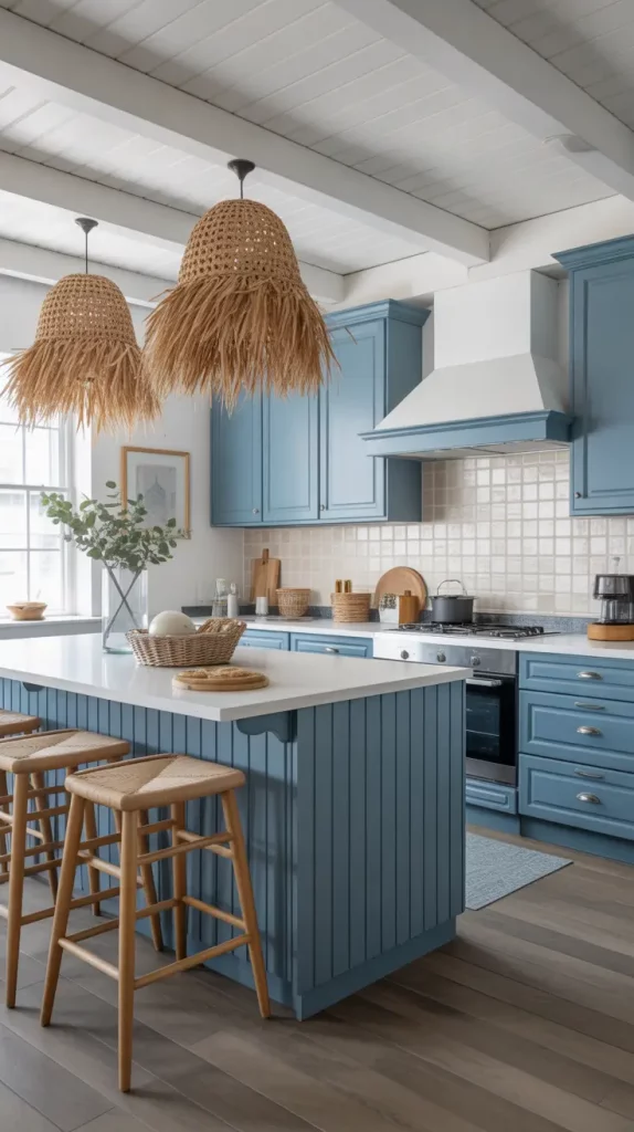
Coastal Living magazine often champions blue-and-white palettes, calling them “the salt and pepper of beach house style.” I’ve used this exact layout in homes from Cape Cod to California, and it never fails to feel fresh and timeless.
If I were expanding this palette, I’d add touches of natural brass and textured linen in window treatments to soften the cooler hues and bring in a more lived-in warmth.
Warm Wood Cabinets And The Colors That Complement Them
Working with kitchen colors schemes wood cabinets is about harmony—selecting hues that support and elevate the wood’s tone. Whether you have maple, cherry, or walnut, the trick is finding wall and countertop colors that bring out the best in the grain rather than compete with it.
For mid-tone woods, I often go with pale olive or creamy mushroom wall colors. Add a soft gray stone countertop, matte black pulls, and tile in neutral, sandy shades for a seamless palette. Open shelving in the same wood tone ties it all together beautifully. A modern twist? Pairing warm wood with light terrazzo flooring.
Designers like Amber Lewis often highlight the natural grain of wood cabinetry with muted colors and texture-rich accents. I think this strategy works beautifully—it makes the space feel grounded, warm, and incredibly welcoming.
To enhance the look, I’d suggest adding soft under-cabinet lighting and framed art or pottery in natural clay and linen tones. It’s about letting the wood breathe while creating a polished design.
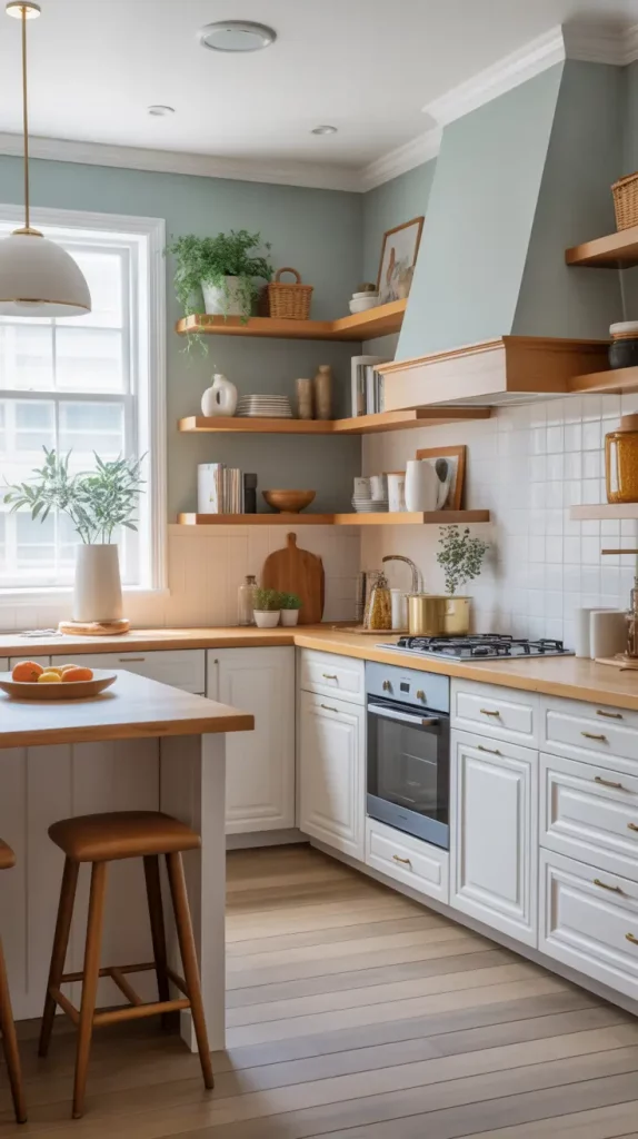
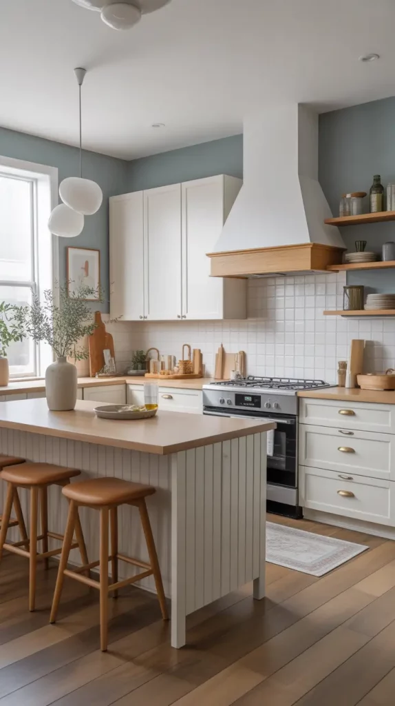
Bright And Airy Kitchen Color Schemes For Open Spaces
In open-concept homes, kitchen colors schemes bright are essential to creating a seamless, uplifting atmosphere. These spaces need color palettes that reflect natural light and visually expand the area without feeling flat. I usually lean into pale neutrals, soft citrus tones, and delicate blues to create that feeling of sunshine and openness.
One of my favorite layouts for this is soft buttercream walls, off-white cabinetry, and a pale aqua backsplash. Add light oak flooring, minimal matte gold hardware, and sheer linen curtains to keep things glowing. I like to incorporate large glass pendants and a central island with creamy quartz to reflect light from every direction.
Design expert Sarah Sherman Samuel often talks about the “light bounce effect”—the way light interacts with bright tones to energize the room. I’ve applied this theory in multiple open-concept kitchens, and the result is always a welcoming, joyful space.
If I were to build on this, I’d consider extending the brightness with reflective finishes like glossy tiles or metallic accents to further emphasize the airy feeling.
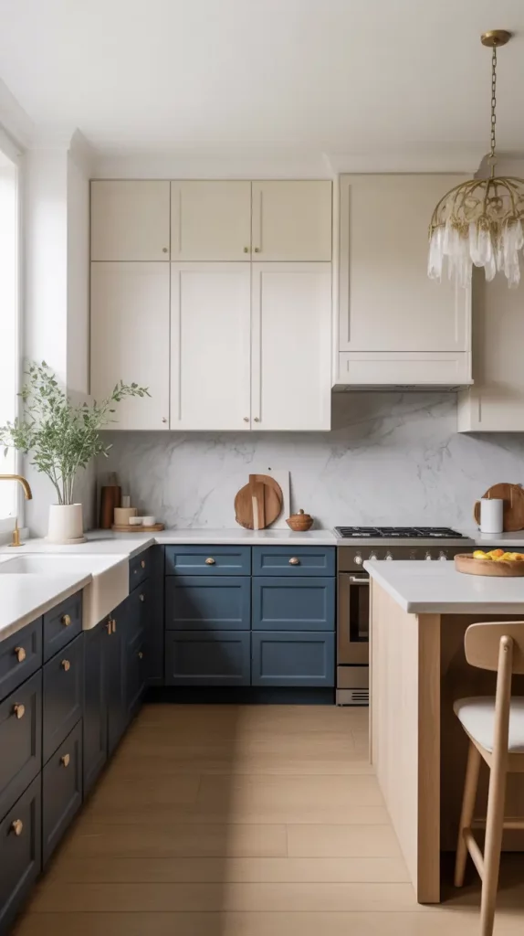
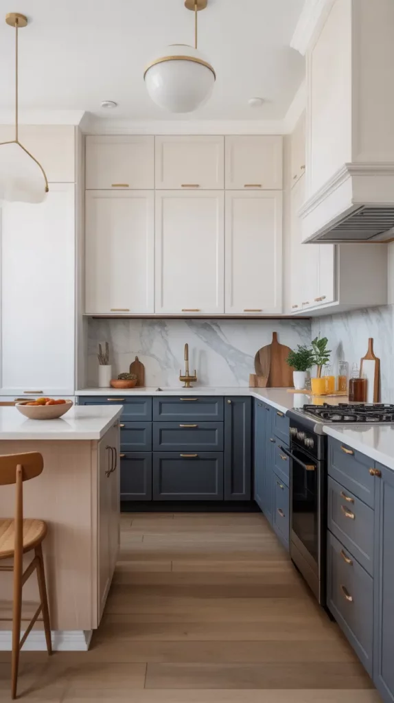
Grey Kitchen Color Schemes That Balance Warm And Cool
Kitchen colors schemes grey are among the most versatile options because they bridge warmth and coolness beautifully. Depending on the undertones—blue, green, brown, or violet—you can create a completely different vibe. I prefer warmer greys in kitchens with lots of natural wood, and cooler greys for more modern or industrial spaces.
A go-to look for me: dove grey cabinets, a soft mushroom-toned wall, and brushed nickel or matte black hardware. To add contrast, I often use a black stone or concrete-look countertop with warm oak or birch flooring. Stainless appliances blend seamlessly, while natural linen barstools or woven textures prevent it from feeling too cold.
I once read in Dwell magazine that grey is the “new backbone neutral” for kitchens. And I’ve found that to be true—it plays nicely with both rustic and modern details, making it ideal for transitional spaces.
To further refine the space, I’d suggest incorporating soft art pieces or ceramic decor in neutral tones to add personality and keep the palette from feeling too uniform.
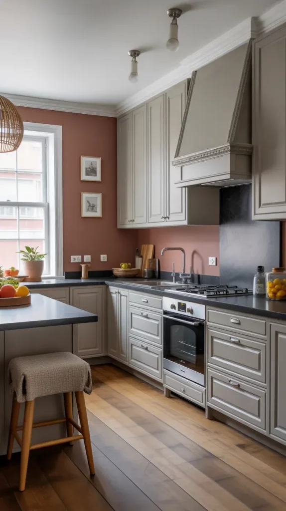
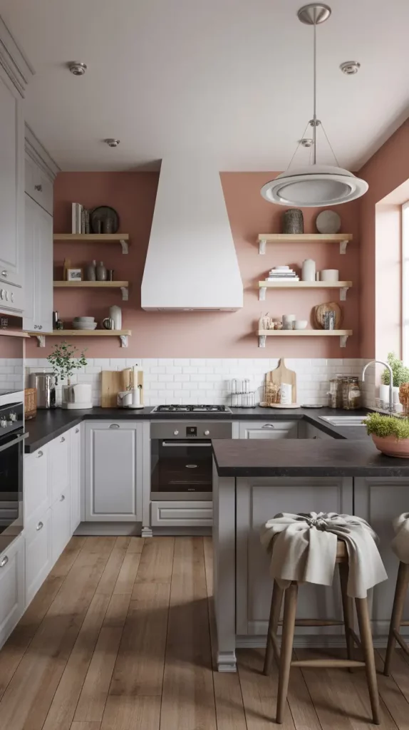
Color Schemes That Pair Beautifully With Black Appliances
Designing around kitchen colors schemes black appliances can be tricky—too dark, and the room feels heavy; too light, and the appliances stick out. I’ve found success in using earthy neutrals, cool blues, and muted greens to create harmony between cabinetry and appliances without compromising style.
A layout I love uses mid-tone green-gray cabinets, soft beige walls, and a matte black faucet to tie into the appliances. For contrast, add natural stone counters and a backsplash in a creamy zellige tile. Open oak shelves or a black metal-framed island can help bridge the color palette across the room.
HGTV once noted that black appliances are making a comeback—especially in matte finishes—and I agree. They feel luxurious, especially when paired with a clean, cohesive palette and just a touch of warmth elsewhere.
If I were expanding this design, I’d include a built-in black coffee station or matching hood range to give the appliances even more design presence.
Two-Tone Kitchen Color Schemes That Look Designer-Made
I love using two-tone kitchen colors schemes—they immediately elevate a space and add dimension. Whether it’s dark base cabinets and white uppers, or contrasting island colors, this approach creates movement and interest without overwhelming the design.
One of my favorite combinations is navy lower cabinets with crisp white uppers and a marble-look backsplash. I like pairing this with brass or mixed-metal hardware and a soft wood island. Add bar stools with leather or boucle cushions and sculptural lighting for a finished look that feels high-end.
Domino recently ran a feature on two-tone kitchens and called them “instant architecture”—I couldn’t agree more. They give the illusion of architectural structure even in simple layouts.
To take it further, I’d suggest bringing the two-tone theme into open shelving, using floating shelves in a third, neutral tone (like oak) to bridge the two main colors effortlessly.
Brown Cabinets? Try These Modern Color Pairings
Designing around kitchen colors schemes brown cabinets can feel challenging if you’re used to all-white trends. But when styled right, they feel rich, inviting, and surprisingly current. I like to update the look using fresh, muted tones like sage, blush, or dusty blue.
For example, pair dark espresso or chocolate-stained cabinets with light green walls and cream or stone countertops. Add brushed gold or matte bronze hardware for warmth. In lighter brown cabinets, try warm pink undertones and mid-century details like retro tile or brass lighting.
InStyle Home once profiled a kitchen that mixed milk chocolate cabinets with a soft salmon backsplash—and it completely shifted my thinking. Done well, it’s unexpectedly elegant.
If I were pushing this palette further, I’d include tactile textures—like a brick or clay accent wall, or vintage glass canisters to add charm and richness.
Kitchen Color Schemes Inspired By Nature
Nature-inspired kitchen colors schemes are perfect for bringing a grounded, organic feel into the heart of your home. I gravitate toward stone, moss, clay, sand, and sky tones—all of which work beautifully with wood, rattan, and ceramics.
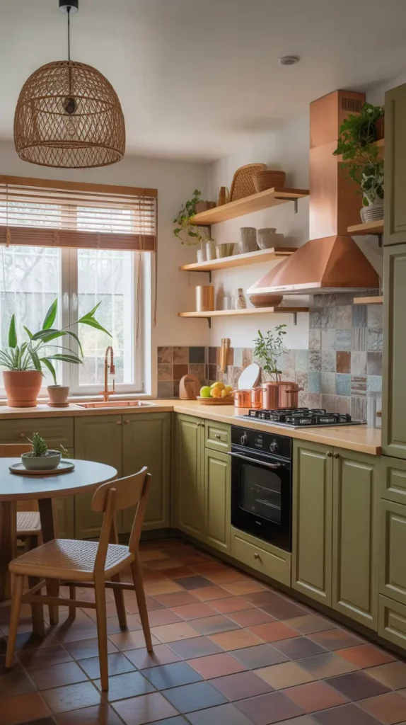
A dream layout might feature moss green cabinets, warm terracotta tile flooring, and a backsplash in variegated stone or recycled glass. Add copper or pewter fixtures, woven pendant lights, and open wooden shelving with pottery and plants to complete the aesthetic.
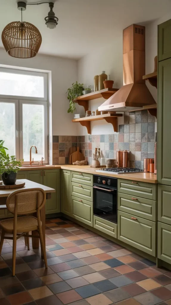
Elle Decor recently highlighted nature-based palettes as a top trend, citing their psychological benefit—reduced stress and improved focus. I’ve seen this effect firsthand. Clients with these palettes often describe their kitchens as “a retreat.”
To elevate this, I’d bring in raw-edge stone slabs for countertops or a live-edge wood bar for added natural texture and design depth.
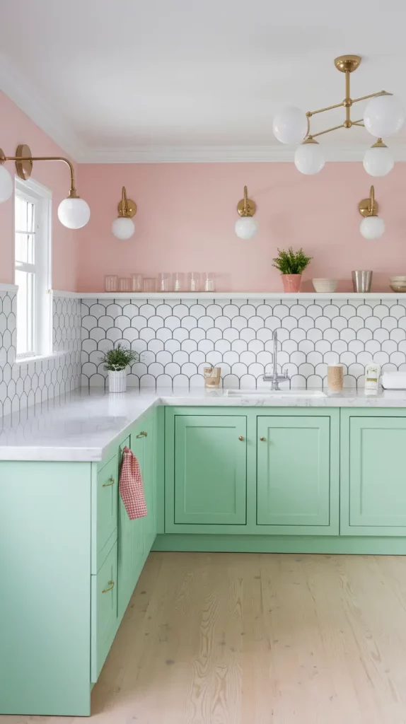
Soft Pinks, Corals, And Clay Tones For Warmth
Blush, coral, and clay bring an unexpected warmth to kitchen colors schemes paint, especially when combined with natural textures and soft lighting. These tones create a cozy, welcoming vibe and work particularly well in eclectic or boho-style kitchens.
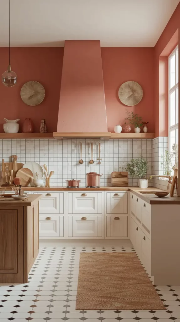
My go-to layout includes clay pink walls, white upper cabinets, and wood lower cabinets. Brass fixtures and vintage-style hardware bring a charming, lived-in feel. I also love adding open shelving with earthy ceramics and soft globe lighting to highlight the tones.
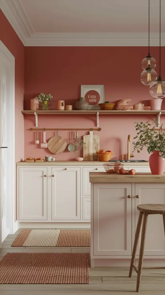
Better Homes & Gardens recently noted that clay pink is becoming a favorite for kitchens due to its “neutral-meets-color” quality. I think it adds just the right pop—more than beige, but calmer than red.
If I were designing this space, I’d include natural woven textures—rattan stools, sisal rugs, or bamboo blinds—to build warmth and tie the tones together organically.
Dramatic Black And White Kitchen Color Combos
Black and white is one of the strongest color combinations for a kitchen. It’s both exciting and everlasting and when done correctly, it looks both stylish and bold. This palette is ideal for modern homes and lofts because the design and lighting are so important there. A difference in color can make a small kitchen look more stylish and attractive.
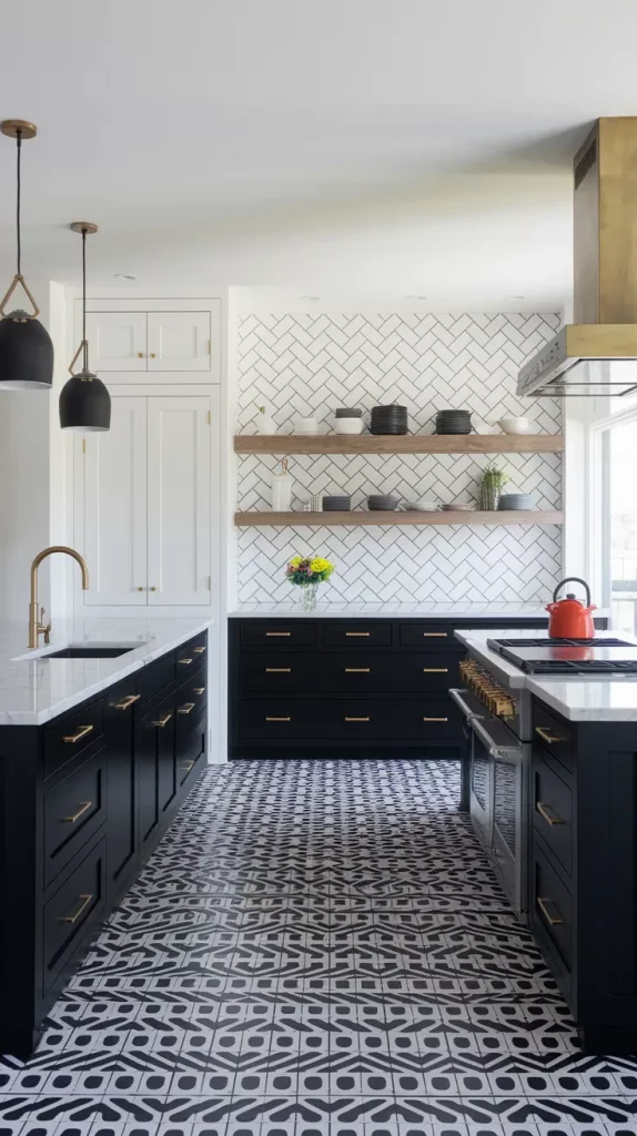
I usually choose matte black for the lower cabinets and crisp white for the uppers in this layout. A white marble or quartz countertop helps separate the different color tones. Add black fixtures, interesting pendant lights and either glossy black zellige or herringbone white tile on the backsplash. Choose bar stools made of steel or wood to tone down the modern look.
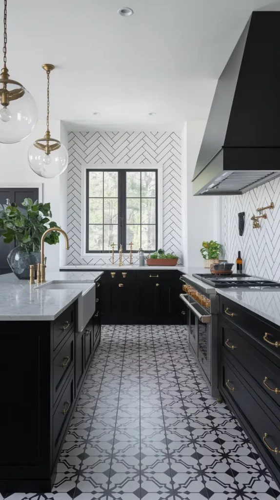
Interior designer Jean Stoffer once said in a Veranda feature that “black and white kitchens feel intentional, not safe.” I’ve always appreciated that. What matters most is using good materials and paying attention to every detail—poor fixtures or mismatched colors will be obvious.
You could also use floor tiles with a striking black-and-white geometric design or add a wood island to make the space feel cozier and softer.
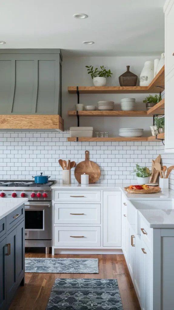
Muted Greens And Sage For An Organic Vibe
Muted green and sage are popular colors in kitchens because they are very soothing and go with almost anything. They remind people of the outdoors—herbs, plants and peaceful garden paths. They are perfect for country-style homes, Scandinavian designs and any room wanting to highlight sustainability and peace.
I really enjoy seeing soft sage cabinets, creamy walls and brushed brass fixtures together. Install light wood open shelves and choose a countertop made from limestone or travertine. The use of green ceramic tile or zellige as a backsplash helps create a cohesive look and black metal or wood stools add some contrast.
HGTV declared sage green as the new neutral and I think that’s very true. I finished a farmhouse renovation where the green cabinets matched the scenery seen outside the windows so well, it felt as if they were part of nature.
For an even better look, I’d suggest including soft botanical prints, linen curtains and a few potted plants on the sill or shelves.
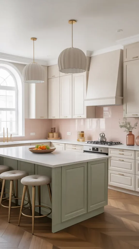
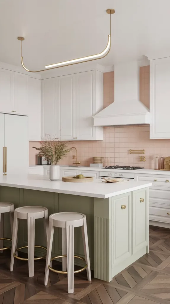
Pastel Kitchen Color Schemes That Feel Playful Yet Grown-Up
Pastels are now popular in kitchens, not only in nurseries and beach houses. Kitchens with pastel colors and modern shapes look soft, improved and fresh when you add natural materials. I often suggest adding lavender, mint, butter yellow or baby blue to kitchens that want to be cheerful but also mature.
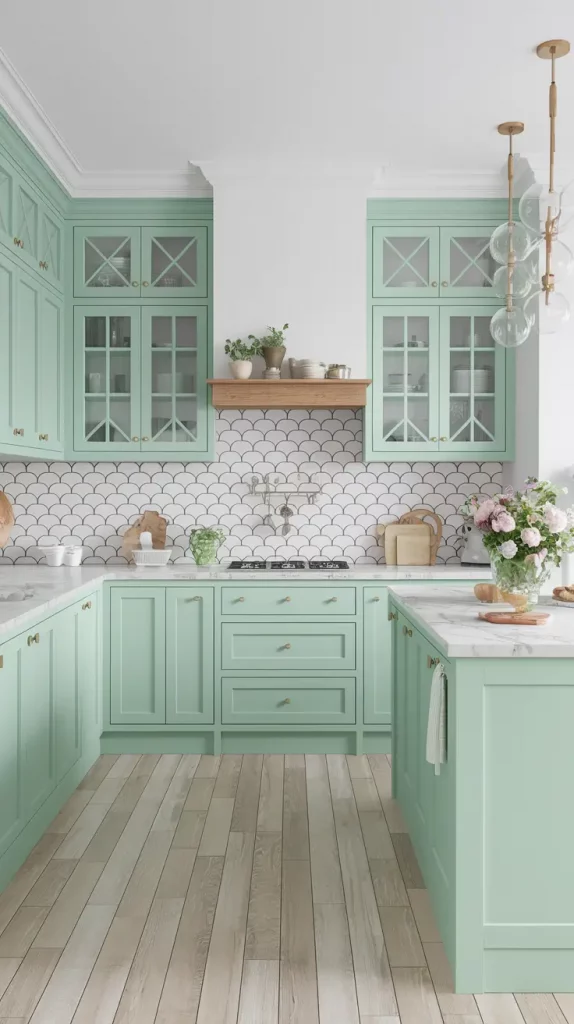
I really enjoy a design that has pale mint green cabinets, light blonde wood floors and white marble countertops. Pick chrome or nickel fixtures, add a scalloped backsplash and paint the open shelves a light pastel color. Add globe pendant lights and some natural decor to give the area a solid feel.
In Architectural Digest, designer Bobby Berk stated, “Pastels bring a sense of positivity and where could you use that more than in your kitchen?” I believe these colors look best in homes that are light or have a vintage style.
What could push this even further? Trying color-blocked bar stools or using pastel tiles with a fun design on the floor would give your kitchen a stylish look.
Unexpected Color Pairings That Just Work
I really like using colors in the kitchen that may seem like they wouldn’t go well together, but they actually do. Deep plum with mustard yellow. Teal with terracotta. Blush pink with moss green. You can make your space truly unique by mixing different styles, as long as you’re willing to try something new.
I’ve tried a bold idea by using teal cabinets that are muted, terracotta tile for the backsplash and vintage brass handles. I added a white ceiling, cream countertops and wood features everywhere to balance the richness. To make it work, choose a unifying tone such as warm metal or natural wood, that links the colors together.
In a previous article, Design Milk stated that these pairings “can help you break design rules successfully.” I agree. The trick is managing undertones so nothing feels jarring. If you are creative or want a space that stands out, these combos are perfect for you.
If I was working on this more, I’d add handmade touches like ceramic knobs, old-fashioned light fixtures or art that matches the secondary colors to create a sense of depth.
Minimalist Monochrome Kitchen Color Schemes
If you want your kitchen to be soothing and sleek, sticking to a single color is a great choice. Just because something is monochrome doesn’t mean it’s dull—it’s about using one color and adding interest with different shades and textures. These kitchens often feel the most high-end and relaxing.
My preferred way to do this scheme is with soft greige everywhere: greige cabinets, walls and backsplash, each in a slightly different form or texture. Include natural stone countertops, beige or linen stools and appliances that are built into the cabinetry. The use of matte hardware and not many open shelves makes the materials and shapes stand out.
Athena Calderone, an interior designer, often talks about quiet luxury and monochrome kitchens fit that description. I once made an ivory kitchen for a photographer and the shadows made the space interesting but not too busy.
I’d add one unexpected touch to make this look stand out such as a sculptural pendant light or a backsplash made of veined stone.
Rustic Farmhouse Kitchen Color Ideas With Character
To have a farmhouse kitchen, you don’t have to use only white and distressed wood; it’s all about charm, texture and comfort. Currently, farmhouse kitchens use colors that are both functional and cozy. I often mix sage, deep red, ochre or navy with wood and cream colors.
I frequently design a look that includes reclaimed wood cabinets, white subway tile for the backsplash and soft blue-gray walls. Add black lighting, show the beams and display vintage plates on open shelves. If you prefer, choose butcher block countertops and an apron-front sink, along with antique brass fixtures.
Mixing old and new is a common suggestion from Country Living for a true farmhouse style. I’ve stuck to this advice and used salvaged barn wood for the paneling around the islands—it makes the room unique.
Farmhouse style needs gingham or floral fabrics, a hanging pot rack and a bench by the window to give it the real touch.
Urban Modern Kitchen Colors That Feel Luxe And Livable
Urban kitchens tend to focus on creating a stylish space that is also easy to live in. You’ll notice a lot of charcoal, deep green, burnt sienna and sleek greys combined with polished concrete or shiny tile. They are suitable for use in city apartments, modern townhomes or industrial lofts.
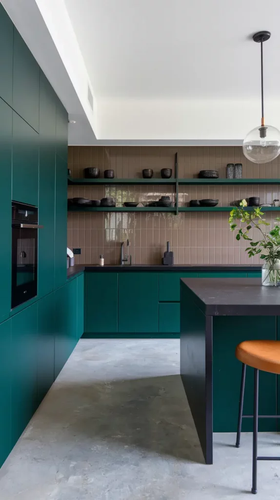
A layout I really enjoy is made up of deep green cabinetry, matte black countertops and polished concrete floors. Match it with a shiny taupe tile backsplash, shelves with steel frames and simple lighting. Warm it up with leather stools and bronze fixtures. Adding a statement hood vent or open wine storage will give your kitchen an upscale look.
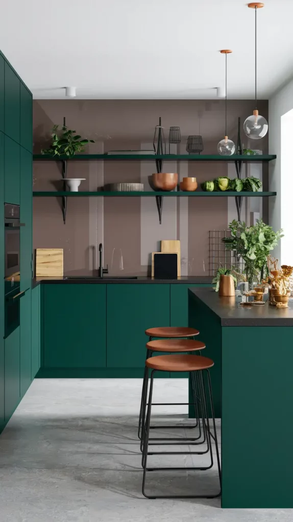
Elle Decor calls this style “tailored comfort,” which means it is both well-designed and warm. I often use this method in smaller kitchens to help the space look larger and more elegant.
If I were modifying it, I’d build in a breakfast bar or make the island wider so you can work on your laptop at the same time.
High-Contrast Kitchen Colors That Add Instant Drama
If you enjoy a striking kitchen design, high contrast colors will make your kitchen stand out right away. It works best by mixing dark and light colors which results in a kitchen that looks confident and has a lot of character. It looks great in homes that have high ceilings, wide windows or a large, open floor plan.
I tend to use color schemes where the lower cabinets are navy or emerald green and the uppers are white or cream. Having a black stone or marbled quartz countertop helps blend the different tones in the room. I use either black pendants or brass lighting fixtures to make the contrast more noticeable. Choose reeded cabinets, fluted glass doors or patterned tiles to add texture to your kitchen design.
Designer Kelly Wearstler often talks about using “visual rhythm” in kitchens and that’s what these palettes do. I have applied this idea in both loft kitchens and suburban remodels and the difference it makes is clear.
If I wanted to add to this idea, I’d include more neutral colors through stools, artwork or a nearby butler’s pantry to keep the balance and still have plenty of visual interest.
How To Choose The Perfect Kitchen Color Scheme For You
The first thing to ask yourself is how you want the space to make you feel. Whether you’re drawn to calming tones, bold contrast, or nature-inspired warmth, the color palette should reflect your lifestyle and the mood you want to create. My advice is to look at the light, cabinetry and colors in the nearby rooms before you finalize your paint or finish.
In my consultations, I guide clients through three simple steps: identify your anchor (wood tone, cabinet color, or countertop), choose a complementary wall color, and finally, layer in accent hues through backsplash, hardware, or furniture. If your cabinets are white, you could choose cool grey or soft sage for the walls and if your cabinets are oak, you might want to use creamy walls with muted green accents.
Architectural Digest points out that the kitchen is the center of your home, so make it feel comfortable for you. That line has stuck with me. I’ve found that when I design with the homeowner’s personality and habits in mind, the results are always more successful than if I just follow the latest trends.
If you’re not sure, I suggest using neutrals and adding color by changing around reversible items like stools, lamps or curtains. It allows you to change your style as your interests or way of life change.
Conclusion
Cooking is only one purpose for your kitchen; it can also share a story through color. Whether you’re drawn to earthy tones, minimalist monochromes, or statement-making contrasts, the right palette can shift the entire energy of the room. Consider the kitchen colors that will work well with your home and your feelings. I’d love to hear what colors speak to you—drop your thoughts, questions, or color picks in the comments below!