What Is Color Therapy and Why Does It Matter in 2025?
The colors around you have a major impact on your emotional state and physical energy together with your work efficiency. Color therapy remains highly significant for 2025 because people actively transform their homes into wellness havens.
Color therapy or chromotherapy uses various colors to modify psychological and physiological states in people. The historical practices from the past have evolved into a modern science which unites interior design with emotional space support systems.
Understanding color psychology enables you to make purposeful decisions through which your interior spaces improve your everyday life regardless of whether you design your main work environment at home or your relaxing sleep area or kitchen space. This article will explain how colors interact with your psychological state and provide practical methods for using colors in your living area.
How Color Therapy Works in Interior Spaces
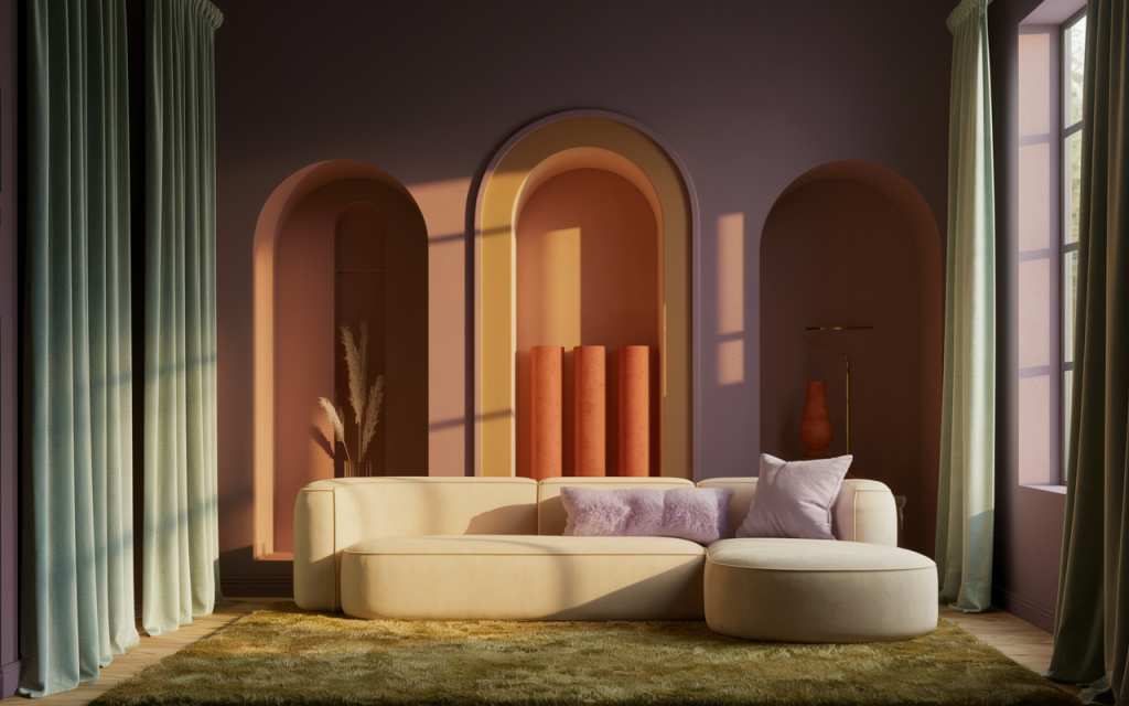
The influence of color on human behavior operates in a gentle yet forceful manner. Our brain generates neurological and hormonal responses to different wavelengths of light which correspond to colors. The human body experiences stimulation through warm tones but finds relaxation through cool tones. The perception of colors depends on three factors which include texture as well as lighting degree and saturation level.
A dimly lit hallway will make deep navy appear oppressive while the same hue creates feelings of security and stability in dimly lit spaces. Interior design that uses color therapy relies upon creating balanced fields of color which purposefully interact with light and space.
A room painted with sunny yellow color creates energetic feelings during morning hours.
Designers currently implement color understanding to maximize focus in home offices as well as create calmness in bedrooms and stimulate appetite through purposefully selected kitchen color schemes.
The Emotional Impact of Different Colors
Warm Colors: Energy, Motivation, Passion
Warm colors within the spectrum include red and orange with yellow. Warm colors carry associations with excitement and warmth and stimulate energy in people. These colors enhance energy levels and produce physiological heart rate increases. The use of red color in particular should be limited because excessive amounts can lead to anxiety symptoms.
Best uses:
- Red: Accent walls in dining rooms to stimulate appetite.
- Orange: Home gyms or creative spaces.
- Yellow: Kitchens or breakfast nooks to invoke optimism.
Cool Colors: Calm, Focus, Serenity
Blue green and purple colors provide a cooling sensation which creates both focus and tranquility in spaces. These color hues function well in spaces dedicated to sleeping, bathing and professional work.
Best uses:
- Blue: Bedrooms or reading areas.
- Green: Living rooms or meditation corners.
- Lavender: Spa-like bathrooms or nurseries.
Neutral Colors: Stability, Balance, Versatility
The emotional neutral zone consists of white and beige as well as gray and taupe color families. Such colors combine powerful emotions with ability to match many other color choices. Gray areas tend to create a chilly atmosphere when they lack proper textural elements and warmth.
Best uses:
- Gray: Offices or entryways when paired with wooden textures.
- Beige: Living rooms with colorful decor.
- White: Kitchens, especially in minimalist homes.
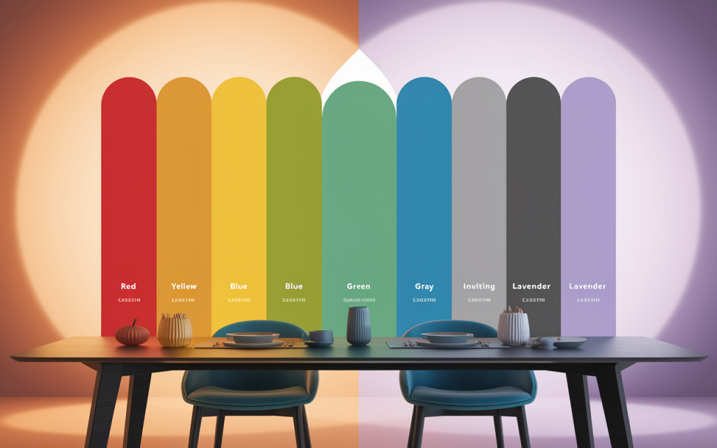
Table: Emotional Associations of Popular Colors
| Color | Emotion | Recommended Space |
|---|---|---|
| Red | Passion, energy | Dining room |
| Yellow | Cheerfulness | Kitchen, breakfast nook |
| Blue | Calm, stability | Bedroom, study |
| Green | Balance, renewal | Living room, home office |
| Gray | Neutrality, calm | Office, hallway |
| Lavender | Serenity, comfort | Bathroom, nursery |
Applying Color Therapy by Room
Bedroom: Your Restorative Sanctuary
The bedroom and study spaces should use pale blue and soft green colors. High saturation tones should be avoided because they create excessive stimulation. Textiles and lighting elements should be chosen to enhance the calming atmosphere.
Living Room: Social Warmth
The colors beige, taupe and soft terracotta create a comfortable atmosphere when used as neutrals. Green and blue accents will help achieve balance in the atmosphere.
Home Office: Focus and Productivity
Sage green and powder blue provide the best color options because they help people focus without making them feel exhausted. The monotony of too much gray color becomes unappealing so introduce natural textures into the space.
Kitchen and Dining: Energy Boost
The energetic tones of sunny yellow and coral should be considered for this space. The chosen colors will both stimulate hunger and create positive feelings. Apply these colors as accents to prevent space-overload.
Kids’ Room: Stimulating Yet Soothing
Pastel shades of soft lilac and mint green should be your color choice. The chosen colors enable creative thinking without creating excessive mental stimulation.
What color rules your bedroom space at present? The color scheme in your bedroom space affects your sleep quality in either a positive or negative way.
Color Trends in Interior Design for 2025
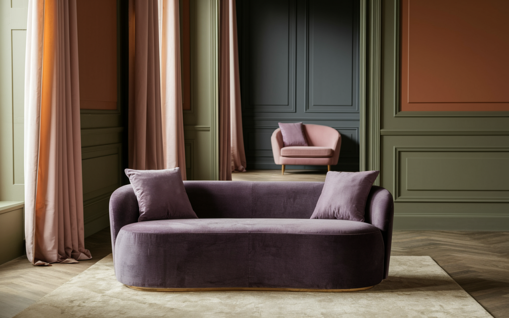
Designers will prioritize emotionally intelligent design schemes which will become standard practice in 2025 interiors. The 2025 Color of the Year by Pantone unites deep violet and gray undertones to create a sophisticated atmosphere of calmness. Other emerging hues:
- Muted terracotta: For warmth without intensity
- Dusty teal: A cool, grounded alternative to navy
- Earthy olive: Balancing, rich, and inviting
Trending Combinations:
- Terracotta + sage green
- Dusty pink + charcoal gray
- Creamy beige + pale lavender
A Step-by-Step Guide to Implementing Color Therapy
1. Define the Purpose of the Room
The desired emotional outcome for the space should be either relaxation or focus or energy.
2. Choose a Base Color
The main color selection should align with the intended function of the space (rest with blue tones and creativity with yellow tones).
3. Add Accent Colors
Two complementary accent shades should be introduced to create visual contrast and emotional equilibrium.
4. Factor in Lighting and Materials
The intensity of natural light enhances color appearance but artificial light tends to alter color tones. Wood, metal or fabric materials help to adjust color effects.
Common Mistakes to Avoid
- Overloading a room with saturated hues
- Ignoring how lighting affects perception
- Using trendy colors that don’t align with personal needs
Checklist: Color Therapy Do’s and Don’ts
Do:
- Match colors with emotional goals
- Test paint samples at different times of day
- Balance bold tones with neutrals
Don’t:
- Follow trends blindly
- Use harsh contrasts in restful areas
- Neglect personal preference for design rules
Final Thoughts: Let Color Work for You
- Color therapy isn’t just a trend—it’s a powerful design tool.
- Every hue affects your mental and emotional well-being.
- In 2025, we have more tools than ever to customize our environments mindfully.
Which color would you select to paint your home office space in order to improve your concentration? Place your thoughts in the comment section.
The article can be shared through Facebook and X and Telegram.