How to Combine Neutral Shades in a Summer Interior Without Getting Boring: Tips for 2025
Why Neutral Shades Are a Major Trend for Summer Interiors in 2025
The usage of neutral shades will control more than 60% of interior design projects for summer 2025. The reputation of neutrals as “dull” or “safe” no longer exists. Neutral colors create an eternal foundation for creativity which becomes particularly essential during summer months.
Neutral interiors attract people because they provide a peaceful and uncluttered appearance. The summer season allows these shades to generate spaces which maintain freshness and sophistication while remaining breathable. A neutral color scheme becomes unappealing when it lacks proper balance.
This article presents a step-by-step guide to creating dynamic neutral color combinations which will be perfect for summer 2025. The article provides functional design solutions that work well for both beach properties and urban apartments.

The target audience who will gain the most from reading this article is
- Homeowners planning a summer refresh.
- Design enthusiasts looking for seasonal inspiration.
- Interior designers seeking fresh, client-ready ideas.
How to Combine Neutral Shades Effectively
Warm vs. Cool Neutrals: Why Temperature Matters
People commonly fail to mix warm and cool neutrals unless they have a specific purpose in mind. A combination of warm taupe with cool gray becomes disjointed unless proper balance is achieved.
The warmth of beige along with cream and tan tones generates feelings of comfort as well as luxury. These colors function perfectly with sunlight that enters rooms naturally during summer months. The crisp refreshing aspect which modern rooms require becomes possible through cool neutral colors including pale stones together with soft grays.
Design cohesion requires you to use either all warm or all cool base tones in your design.
Have you ever observed that modifying the tone in a space can produce a substantial transformation of its atmosphere?
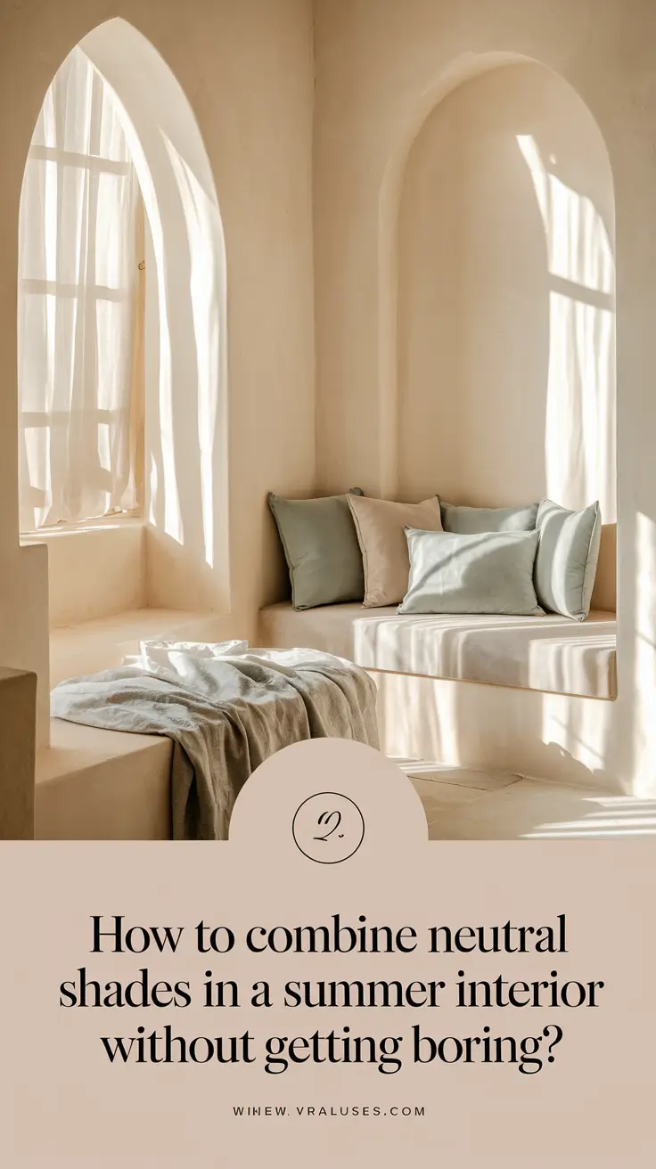
Layers and Textures: The Secret Ingredients
Color alone isn’t enough. Neutral interiors gain their life force through the combination of layers and textures.
- Linen curtains for a breezy, effortless look.
- Matte and gloss finishes to add subtle contrasts.
- Woven baskets and rattan furniture for organic, tactile appeal.
The following table provides you with a helpful guide:
| Texture | Effect | Where to Use |
|---|---|---|
| Linen | Airy and light | Curtains, pillows |
| Cotton | Soft and fresh | Bed linens, slipcovers |
| Rattan | Earthy warmth | Chairs, pendant lighting |
| Polished Stone | Cool elegance | Tabletops, decorative objects |
A room becomes more inviting and richer when you combine at least three different textures.
5 Inspiring Ideas to Energize a Neutral Palette This Summer
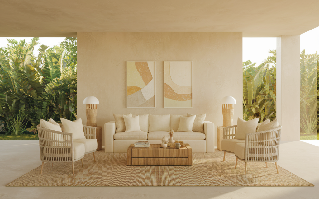
1. Natural Materials: Nature as Your Palette Partner
Nature shows its best during summer time. Why not bring it indoors? Light woods such as oak and ash should be used to establish an outdoor connection throughout the space. The welcoming appeal of light-toned wood exists without overpowering the interior space.
Suggestions:
- Wooden coffee tables.
- Rattan baskets.
- Light birch shelving units.
2. Mastering the Whites: Cream, Pearl, and Ivory
Think white is just… white? Think again! The combination of different white tones in 2025 represents an elegant way to achieve depth.
Examples:
- Creamy whites on walls.
- Pearl accents in cushions or throws.
- Ivory linens for breezy bed styling.
When you layer different white tones you achieve depth and prevent the hospital-like appearance.
3. Minimal Pastel Accents: Less Is More
To add tiny highlights of color choose minimal pastel accents. Choose pastel shades such as mint, blush and sky blue that are barely visible.
How to do it:
- A mint-colored vase.
- Blush-toned throw pillows.
- Light lavender artwork.
4. Lighting: Let There Be (Natural) Light
Lighting becomes the main attraction when you design a space that lacks any particular color scheme. Sheer window treatments should be used to maximize summer natural light entry.
Warm LED lights should be your selection for nighttime illumination to create a comfortable atmosphere. Multiple lighting fixtures including overhead illumination and ground lights and string bulbs can produce harmonious effects in the space.
When you examine your environment which looks different while illuminated by cool white light compared to warm golden light have you ever observed this shift?
5. Greenery: The Ultimate Refresh Button
Any space receives its life force from live plants. Neutral environments display plants as organic decorative elements which become part of the living design.
Top picks for 2025:
- Fiddle-leaf fig.
- Monstera deliciosa.
- Olive trees.
Plants supply both texture and color and restore freshness to any space thereby making them excellent for summer months.
Common Mistakes to Avoid When Designing Neutral Interiors
- Too much sameness: Mix textures to avoid “flat” designs.
- Ignoring lighting: Bad lighting can make even the best neutrals look dull.
- Missing seasonal details: Fresh textiles and decor updates matter each season.
- Quick Thought: Could a simple switch to linen curtains or a textured rug instantly update your space?
Real-Life Examples: Neutral Interiors That Wow
| Room | Key Features |
|---|---|
| Living Room | Light oak floors, woven chairs |
| Bedroom | Layered white textiles, soft rug |
| Outdoor Patio | Rattan furniture, pastel cushions |
What’s Trending: New Neutrals for Late 2025
- Soft Mushroom Gray: A cool yet cozy neutral.
- Sandstone Beige: Earthy, grounding, and fresh.
- Pale Sage Green: The “new neutral” adding life without boldness.
Trend-predictors witness a change in neutral colors toward deeper but still fresh “dustier” shades which possess clean characteristics.
Conclusion: Make Neutral Your Summer Superpower
Neutral color tones remain unstimulating only when used improperly. Your design will offer garden freshness with breezy relaxation when you balance textures with lighting elements and select proper accent items.
Key Takeaways:
- Stick to warm or cool tones for coherence.
- Layer textures for richness.
- Maximize natural light.
- Use plants and pastels to add subtle energy.
- Final Question: Which tip are you most excited to try in your own summer refresh? Share your thoughts in the comments!
Please share this article through Facebook or X or Telegram if it provided you valuable information.
